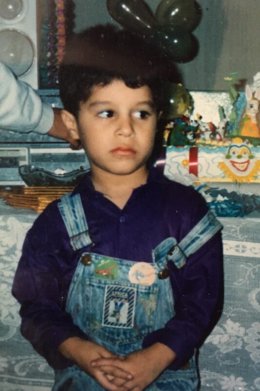
A bit of Vic. Ok, maybe more than a bit
Vic is a Peruvian-Chinese queer creative human from Lima, Peru, living in one of the suburbs in the Austin area, Leander, Texas. Vic grew up in Dallas and has worked as a designer and art director in the Dallas and Austin areas since 2008. They’re finishing their MFA in graphic design at Vermont College of Fine Arts in the spring of 2022. They currently teach full-time as an associate professor of practice at The University of Texas in Austin in the School of Design and Creative Technologies. Their areas of concentration of their research, passion projects, and community service-based work have always focused on using design principles and design thinking to problem-solve and bring awareness about issues faced by vulnerable communities such as theirs. Vic’s creative approach always comes from an empathetic angle or reaction to the matters they have personally experienced as a queer, nonbinary, immigrant, Latinx human being with a disability living in America. Vic’s current research focuses on the effects of gendering design elements throughout the years, such as basic shapes, pictogram systems, typefaces, and colors, within the design and advertising industry. They do this by unpacking visual gender biases by using orthodox and unorthodox design explorations to test their findings. Their outcomes, influenced by queer design history and practices, challenge patriarchal, sexist, ableist, xenophobic, misogynist, and queerphobic views and explore ways to “queerify” graphic design. They are also always looking for ways to create art through design, photography, and writing that reflect their experiences to bring awareness to issues they and their communities face. Vic’s work has been recognized by The Dallas Society of Visual Communication, The One Show in New York, HOW’s Logo Design Awards, Fast Company, and HOW’s International Design Awards.
For more info about Vic and their work, check out yosoyvic.com, or reach out to them at yosoyvic@me.com.
So, what is this thesis about?
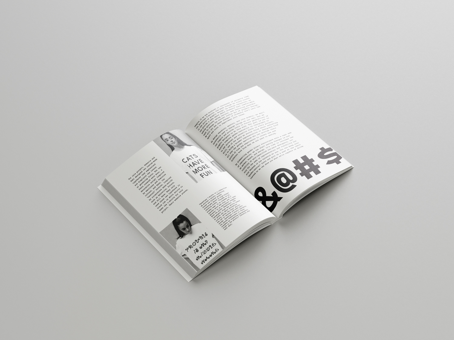
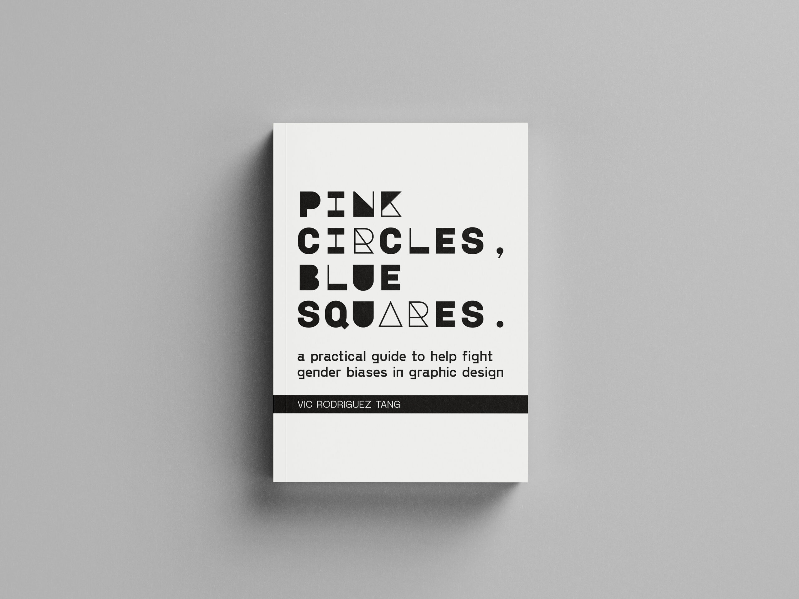
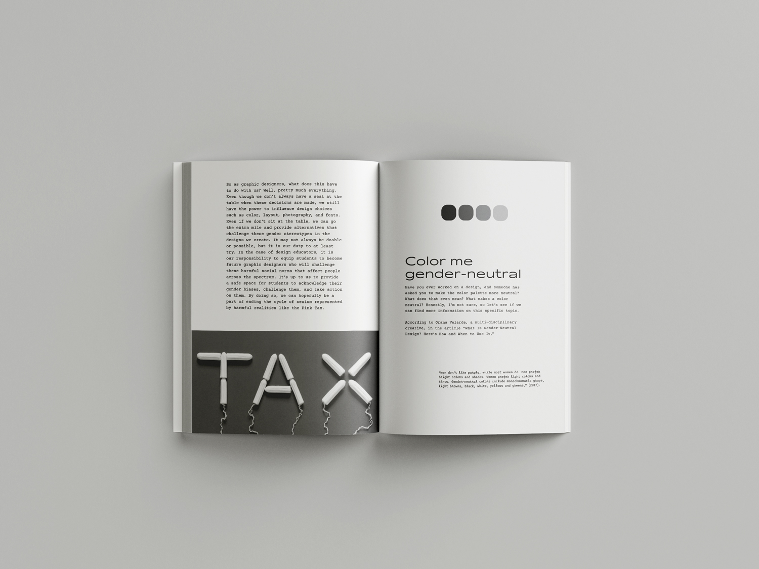
This book is just the beginning of this ever-evolving topic, gender biases in graphic design, but I hope this can serve as a resource for those with questions like I did. Questions such as “why is the color pink for girls?” And “where did that come from?” Or “how does that affect my design?” There have gotta be reasons that explain why we design the way we create! I also realized that many of my gender and graphic design biases started in school. As an educator, I wanted to develop a tool to help others facilitate conversations about gender biases in graphic design. So, here it is! I know this book doesn’t cover everything regarding gender biases and graphic design, and it is written from my perspective. Like everyone else, I have my own biases, but I have tried to create a resource as neutral as possible. I hope you find this book helpful! “Pink Circles, Blue Squares. A Practical Guide to Fight Gender Biases in Graphic Design” is an accessible and inviting resource that compiles historical and sociological aspects of gender biases in graphic design. This book is not meant to be THE resource for this particular area of study but instead an initial resource to help others navigate this topic. My thesis is a tool to help others facilitate conversations in a safe space while inviting participants to acknowledge, question, and challenge their own biases based on their experiences.
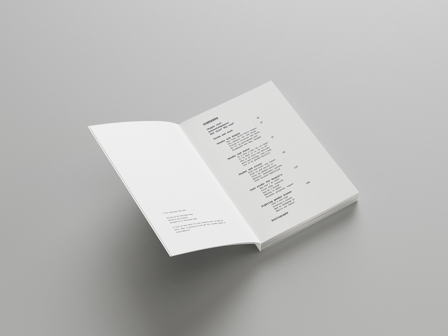
I divided my book into three main chapters that cover three fundamental areas of design, shapes, color, and fonts, and their relationship with the idea of gendering these.
I also included a chapter on a case study of one of my projects, how I addressed my own gender biases, and a chapter with practical resources and exercises to help talk about this topic.
I chose to write about this topic because I've always been interested in gender and how it affects society. Before being a design major, I was a sociology major, where many of my interests in gender further developed.
When I changed my major to design, I did not anticipate using that knowledge in particular, but I'm glad I could find a way to bring these two topics together in my thesis book.
I'm part of a generation challenging the perceived notions of gender, and I wanted to use my voice to speak about this through the lens of a graphic designer and educator.
